1.精灵图
1.1 为什么需要精灵图
一个网页中往往会应用很多小的背景图像作为修饰,当网页中的图像过多时,服务器就会频繁地接收和发送请求图片,造成服务器请求压力过大,这将大大降低页面的加载速度。
为什么使用精灵图(目的): **
为了有效地减少服务器接收和发送请求的次数,提高页面的加载速度**,出现了 CSS 精灵技术(也称 CSS Sprites、CSS 雪碧)。
核心原理:
将网页中的一些小背景图像整合到一张大图中 ,这样服务器只需要一次请求就可以了。
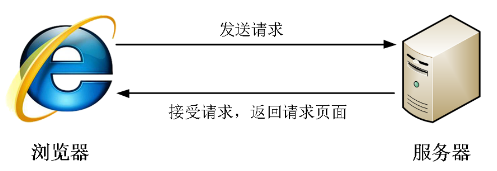
精灵图举例: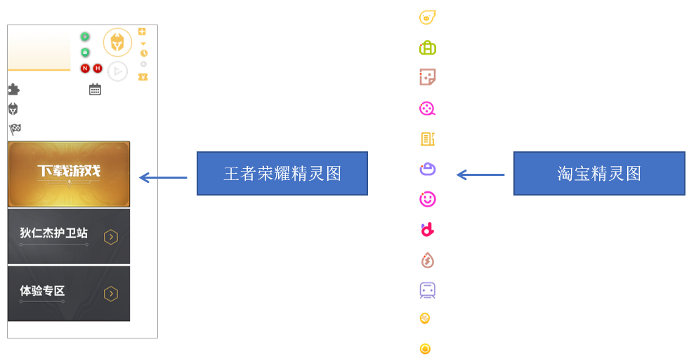
1.2 精灵图(sprites)的使用
使用精灵图核心:
- 精灵技术主要针对于背景图片使用。就是把多个小背景图片整合到一张大图片中。
- 这个大图片也称为 sprites 精灵图 或者 雪碧图
- 移动背景图片位置, 此时可以使用 background-position 。
- 移动的距离就是这个目标图片的 x 和 y 坐标。注意网页中的坐标有所不同
- 因为一般情况下都是往上往左移动,所以数值是负值。
- 使用精灵图的时候需要精确测量,每个小背景图片的大小和位置。
使用精灵图核心总结:
- 精灵图主要针对于小的背景图片使用。
- 主要借助于背景位置来实现---background-position 。
- 一般情况下精灵图都是负值。(千万注意网页中的坐标: x轴右边走是正值,左边走是负值, y轴同理。)
应用案例:
将下面精灵图片切出需要的图标
其中图片坐标需要用切图工具辅助
通过网盘分享的文件:Adobe Fireworks CS6 Ansifa绿色精简版.7z
链接: https://pan.baidu.com/s/1Ij5OioxO8XWgBQFDfnVG4A 提取码: bdfj
--来自百度网盘超级会员v10的分享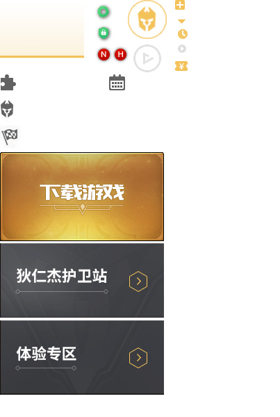
<!DOCTYPE html>
<html lang="en">
<head>
    <meta charset="UTF-8">
    <meta name="viewport" content="width=device-width, initial-scale=1.0">
    <title>Document</title>
    <style>
        .box1 {
            width: 60px;
            height: 60px;
            margin: 100px auto;
            background: url(images/sprites.png) -182px 0;
        }
        .box2 {
            width: 27px;
            height: 25px;
            margin: 200px;
            background: url(images/sprites.png) -155px -106px;

        }
    </style>
</head>
<body>
    <div class="box1"></div>
    <div class="box2"></div>
</body>
</html>
1.3 案例: 拼出自己名字
从下面的精灵图中选出字母拼出自己的英文名 
代码参考:
<!DOCTYPE html>
<html lang="en">
<head>
    <meta charset="UTF-8">
    <meta name="viewport" content="width=device-width, initial-scale=1.0">
    <title>Document</title>
    <style>
        span {
            display: inline-block;
            background: url(images/abcd.jpg) no-repeat;
        }
        div {
            margin: 100px 200px;
        }
        .o {
            width: 117px;
            height: 114px;
            background-position: -368px -275px;
        }
        .m {
            width: 145px;
            height: 120px;
            background-position: -106px -271px;
        }
        .n {
            width: 120px;
            height: 118px;
            background-position: -250px -274px;
        }
        .i {
            width: 63px;
            height: 115px;
            background-position: -325px -141px;
        }
        .s {
            width: 117px;
            height: 122px;
            background-position: -250px -411px;
        }
        .t {
            width: 103px;
            height: 117px;
            background-position: -367px -412px;
        }
        .a {
            width: 109px;
            height: 125px;

        }
        .c {
            width: 118px;
            height: 121px;
            background-position: -233px 0;
        }
        .k {
            width: 107px;
            height: 118px;
            background-position: -493px -139px;
        }

    </style>
</head>
<body>
    <div>
        <span class="o"></span>
        <span class="m"></span>
        <span class="n"></span>
        <span class="i"></span>
        <span class="s"></span>
        <span class="t"></span>
        <span class="a"></span>
        <span class="c"></span>
        <span class="k"></span>
    </div>
</body>
</html>
2.字体图标
2.1 字体图标的产生
字体图标使用场景: 主要用于显示网页中通用、常用的一些小图标。 精灵图是有诸多优点的,但是缺点很明显。
- 图片文件还是比较大的。
- 图片本身放大和缩小会失真。
- 一旦图片制作完毕想要更换非常复杂。
此时,有一种技术的出现很好的解决了以上问题,就是字体图标 iconfont。
字体图标可以为前端工程师提供一种方便高效的图标使用方式,展示的是图标,本质属于字体。
2.2 字体图标的优点
轻量级: 一个图标字体要比一系列的图像要小。一旦字体加载了,图标就会马上渲染出来,减少了服务器请求
- 灵活性:本质其实是文字,可以很随意的改变颜色、产生阴影、透明效果、旋转等
- 兼容性:几乎支持所有的浏览器,请放心使用
- 注意: 字体图标不能替代精灵技术,只是对工作中图标部分技术的提升和优化。
**总结: **
如果遇到一些结构和样式比较简单的小图标,就用字体图标。

如果遇到一些结构和样式复杂一点的小图片,就用精灵图。
使用步骤 字体图标是一些网页常见的小图标,我们直接网上下载即可。 因此使用可以分为:
- 字体图标的下载
- 字体图标的引入(引入到我们html页面中)
- 字体图标的追加(以后添加新的小图标)
2.3 字体图标的下载
推荐下载网站:
icomoon 字库 http://icomoon.io 推荐指数 ★★★★★
IcoMoon 成立于 2011 年,推出了第一个自定义图标字体生成器,它允许用户选择所需要的图标,使它们成一字型。该字库内容种类繁多,非常全面,唯一的遗憾是国外服务器,打开网速较慢。阿里 iconfont 字库 http://www.iconfont.cn/ 推荐指数 ★★★★★
这个是阿里妈妈 M2UX 的一个 iconfont 字体图标字库,包含了淘宝图标库和阿里妈妈图标库。可以使用 AI制作图标上传生成。 重点是,免费!
下载流程:
打开网站
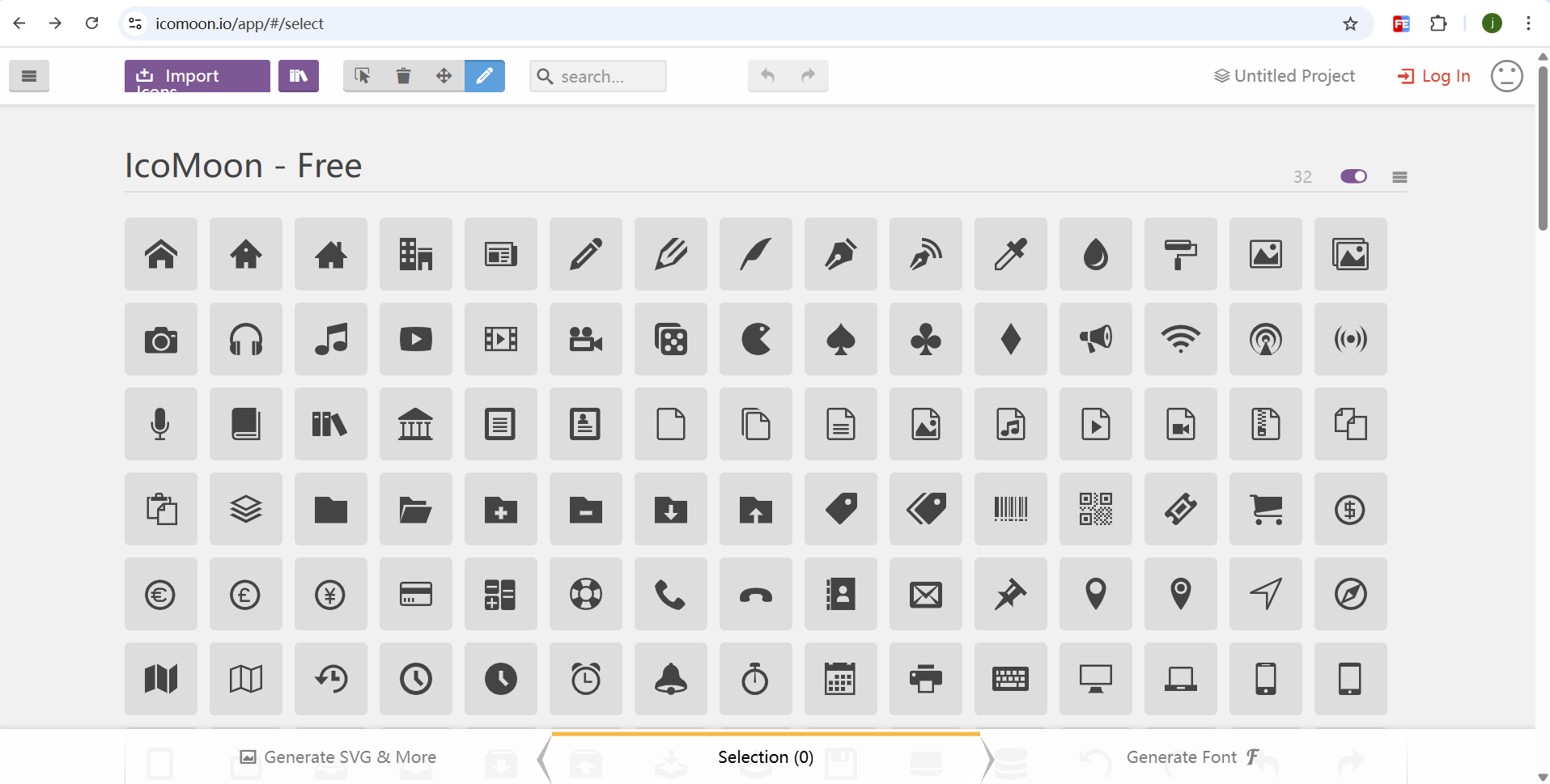
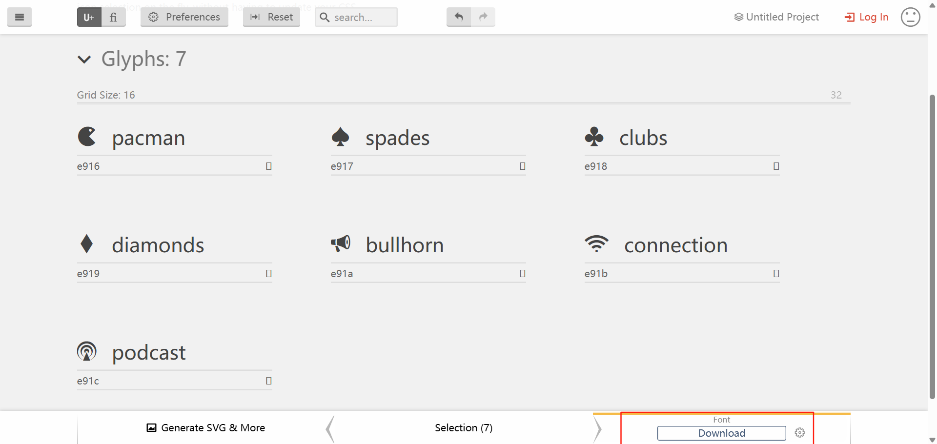
选择想要的图片点击generate font
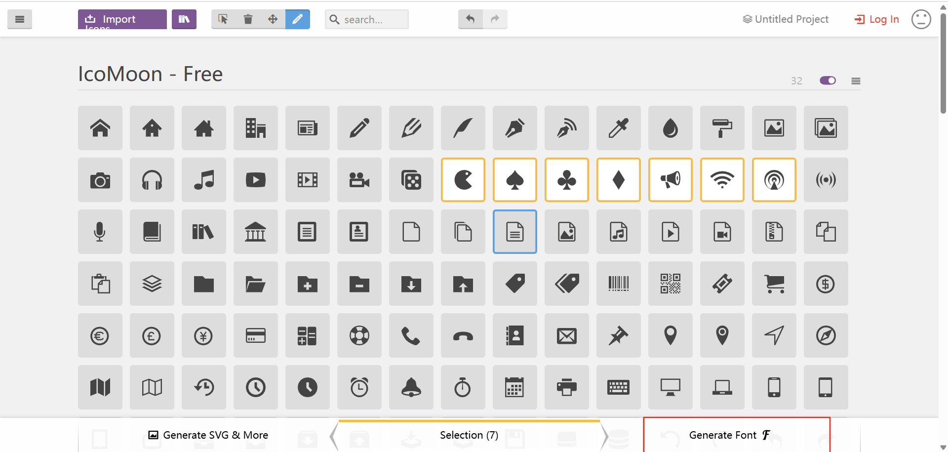
点击download
下载好之后是一个压缩包
解压文件就是我们要的字体图标文件
2.4 字体图标的引入
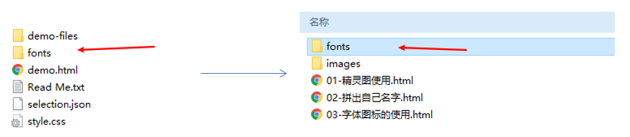
下载完毕之后,注意原先的文件不要删,后面会用。
- 把下载包里面的 fonts 文件夹放入页面根目录下
字体文件格式
| 字体格式 | 说明 |
|---|---|
| .ttf | TrueType字体,兼容性好 |
| .woff | Web开放字体格式,压缩率更好 |
| .eot | IE专用字体格式 |
| .svg | 基于SVG的字体格式 |
- 在CSS 样式中全局声明字体:简单理解把这些字体文件通过css引入到我们页面中。 找到图中文件 将下面这串代码复制到自己的代码中
@font-face {
  font-family: 'icomoon';
  src:  url('fonts/icomoon.eot?s7p2bw');
  src:  url('fonts/icomoon.eot?s7p2bw#iefix') format('embedded-opentype'),
    url('fonts/icomoon.ttf?s7p2bw') format('truetype'),
    url('fonts/icomoon.woff?s7p2bw') format('woff'),
    url('fonts/icomoon.svg?s7p2bw#icomoon') format('svg');
  font-weight: normal;
  font-style: normal;
  font-display: block;
}
html 标签内添加小图标。 找到图中的文件浏览器中打开复制图标
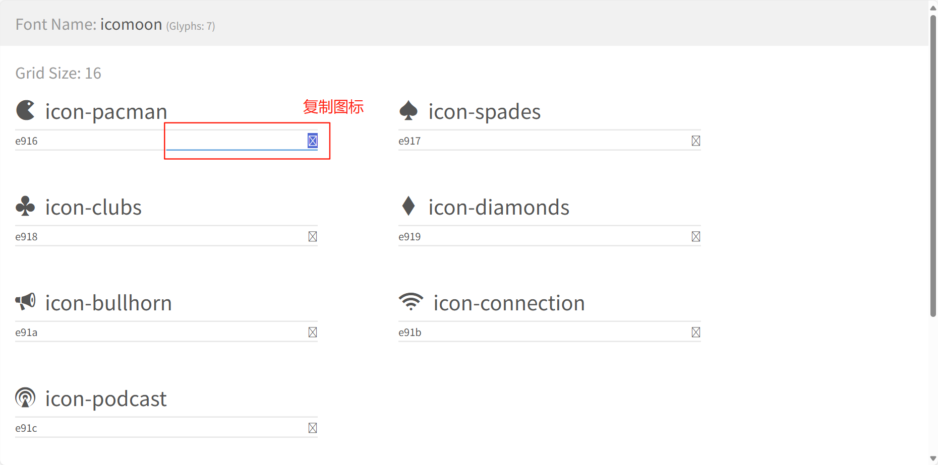
给标签定义字体。
span {
    font-family: "icomoon";
}
注意:务必保证这个字体和上面@font-face里面的字体保持一致 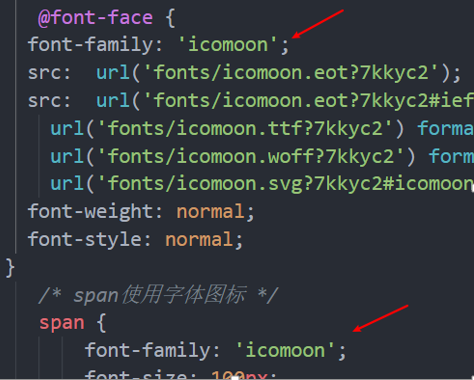
- 完整代码示例 因为是字体图片所以可以添加字体颜色和设置大小
<!DOCTYPE html>
<html lang="en">
<head>
<meta charset="UTF-8">
<meta name="viewport" content="width=device-width, initial-scale=1.0">
<title>Document</title>
<style>
@font-face {
font-family: 'icomoon';
src: url('fonts/icomoon.eot?s7p2bw');
src: url('fonts/icomoon.eot?s7p2bw#iefix') format('embedded-opentype'),
url('fonts/icomoon.ttf?s7p2bw') format('truetype'),
url('fonts/icomoon.woff?s7p2bw') format('woff'),
url('fonts/icomoon.svg?s7p2bw#icomoon') format('svg');
font-weight: normal;
font-style: normal;
font-display: block;
}
span {
font-family: "icomoon";
font-size: 200px;
color: pink;
}
</style>
</head>
<body>
<span></span>
<span></span>
<span></span>
</body>
</html>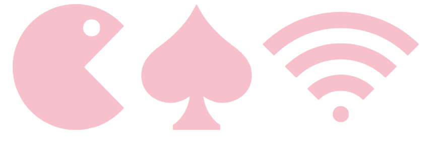
2.5 字体图标的追加
如果工作中,原来的字体图标不够用了,我们需要添加新的字体图标到原来的字体文件中。
把压缩包里面的 selection.json 从新上传,然后选中自己想要新的图标,从新下载压缩包,并替换原来的文件即可。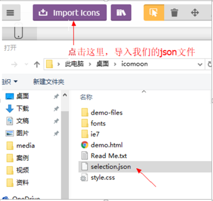
2.6 字体图标加载的原理
在浏览器向服务器请求的时候请求一次就将所有的字体文件都加载了,所以只加载一次 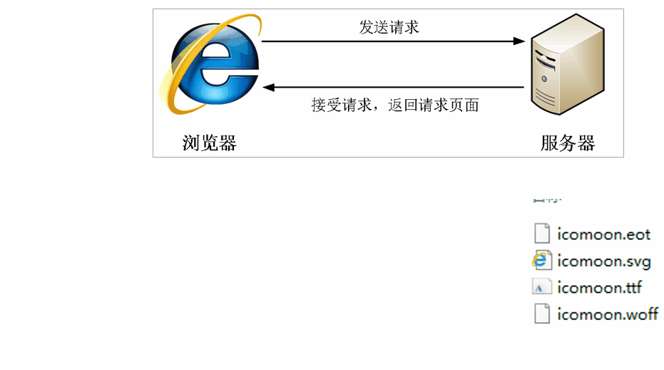
3.CSS 三角
3.1 介绍
网页中常见一些三角形,使用 CSS 直接画出来就可以,不必做成图片或者字体图标。
一张图, 你就知道 CSS 三角是怎么来的了, 做法如下:
<!DOCTYPE html>
<html lang="en">
<head>
    <meta charset="UTF-8">
    <meta name="viewport" content="width=device-width, initial-scale=1.0">
    <title>Document</title>
    <style>
        .box1 {
            width: 0;
            height: 0;
            border: 50px solid transparent;
            border-color: red green blue black;
            line-height:0;
            font-size: 0;
        }
    </style>
</head>
<body>
    <div class="box1"></div>
    <div class="box2"></div>
</body>
</html>
<!DOCTYPE html>
<html lang="en">
<head>
    <meta charset="UTF-8">
    <meta name="viewport" content="width=device-width, initial-scale=1.0">
    <title>Document</title>
    <style>
        .box1 {
            width: 0;
            height: 0;
            border: 50px solid transparent;
            border-left-color: red;
            line-height:0;
            font-size: 0;
        }
        .box2 {
            width: 0;
            height: 0;
            border: 50px solid transparent;
            border-right-color: blue;
            line-height:0;
            font-size: 0;
        }
        .box3 {
            width: 0;
            height: 0;
            border: 50px solid transparent;
            border-top-color: green;
            line-height:0;
            font-size: 0;
        }
        .box4 {
            width: 0;
            height: 0;
            border: 50px solid transparent;
            border-bottom-color: pink;
            line-height:0;
            font-size: 0;
        }
    </style>
</head>
<body>
    <div class="box1"></div>
    <div class="box2"></div>
    <div class="box3"></div>
    <div class="box4"></div>
</body>
</html>
- 我们用css 边框可以模拟三角效果
- 宽度高度为0
- 我们4个边框都要写,只保留需要的边框颜色,其余的不能省略,都改为 transparent 透明就好了
- 为了照顾兼容性 低版本的浏览器,加上 font-size: 0; line-height: 0;
3.2 案例: 京东三角

<!DOCTYPE html>
<html lang="en">
<head>
    <meta charset="UTF-8">
    <meta name="viewport" content="width=device-width, initial-scale=1.0">
    <title>Document</title>
    <style>
        .box1 {
            position: relative;
            height: 250px;
            width: 150px;
            background-color: pink;
            margin: 100px auto;
        }
        .box1 span {
            position: absolute;
            right: 0;
            top: -19px;
            height: 0;
            width: 0;
            line-height: 0;
            font-size: 0;
            border: 10px solid transparent;
            border-bottom-color: pink;
        }
    </style>
</head>
<body>
    <div class="box1">
        <span></span>
    </div>
</body>
</html>
4.CSS 用户界面样式
什么是界面样式
所谓的界面样式,就是更改一些用户操作样式,以便提高更好的用户体验。
- 更改用户的鼠标样式
- 表单轮廓
- 防止表单域拖拽
4.1 鼠标样式 cursor
li {
    cursor: pointer;
}
设置或检索在对象上移动的鼠标指针采用何种系统预定义的光标形状。
| 属性值 | 描述 |
|---|---|
| default | 默认箭头 (通常是一个箭头) |
| pointer | 小手 (链接指针) |
| text | 文本选择器 (I形光标) |
| move | 移动 (十字箭头) |
| not-allowed | 禁止 (带斜杠的圆圈) |
| wait | 等待 (沙漏或旋转圆圈) |
| help | 帮助 (带问号的箭头) |
| crosshair | 十字线 (精确选择) |
<!DOCTYPE html>
<html lang="en">
<head>
    <meta charset="UTF-8">
    <meta name="viewport" content="width=device-width, initial-scale=1.0">
    <title>Document</title>
</head>
<body>
    <ul>
        <li style="cursor: default;">一段文字</li>
        <li style="cursor: pointer;">一段文字</li>
        <li style="cursor: text;">一段文字</li>
        <li style="cursor: move;">一段文字</li>
        <li style="cursor: not-allowed;">一段文字</li>
        <li style="cursor: wait;">一段文字</li>
        <li style="cursor: help;">一段文字</li>
        <li style="cursor: crosshair;">一段文字</li>
    </ul>
</body>
</html>
4.2 轮廓线 outline
给表单添加outline: 0;或者outline: none; 样式之后,就可以去掉默认的蓝色边框。
input {
    outline: none;
}
4.3 防止拖拽文本域 resize
实际开发中,我们文本域右下角是不可以拖拽的。
textarea{
    resize: none;
}
5.vertical-align属性应用
CSS 的 vertical-align 属性使用场景: 经常用于设置图片或者表单(行内块元素)和文字垂直对齐。
官方解释: 用于设置一个元素的垂直对齐方式,但是它只针对于行内元素或者行内块元素有效。
语法:
vertical-align : baseline | top | middle | bottom| 属性值 | 描述 |
|---|---|
| baseline | 默认,元素放置在父元素的基线上 |
| top | 把元素的顶端与行中最高元素的顶端对齐 |
| middle | 把此元素放置在父元素的中部 |
| bottom | 把元素的顶端与行中最低元素的顶端对齐 |
 |
5.1 图片、表单和文字对齐
图片、表单都属于行内块元素,默认的 vertical-align 是基线对齐。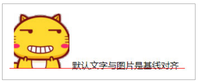
此时可以给图片、表单这些行内块元素的 vertical-align 属性设置为 middle 就可以让文字和图片垂直居中对齐了。
<!DOCTYPE html>
<html lang="en">
<head>
    <meta charset="UTF-8">
    <meta name="viewport" content="width=device-width, initial-scale=1.0">
    <title>Document</title>
    <style>
        img {
            height: 100px;
            width: 100px;
        }

        .img3 {

            vertical-align: middle;
        }

    </style>
</head>
<body>

    这是一个图片<img src="images/R-C.jpg" alt="" class="img3">

</body>
</html>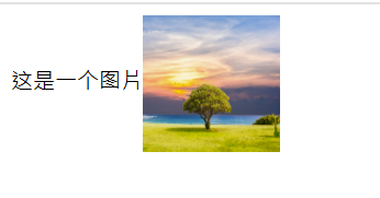
5.2 解决图片底部默认空白缝隙问题
bug: 图片底侧会有一个空白缝隙,原因是行内块元素会和文字的基线对齐。
<!DOCTYPE html>
<html lang="en">
<head>
    <meta charset="UTF-8">
    <meta name="viewport" content="width=device-width, initial-scale=1.0">
    <title>Document</title>
    <style>
        div {
            border: 2px solid red;
        }
    </style>
</head>
<body>
    <div>
        <img src="ldh.jpg" alt="">
    </div>
</body>
</html>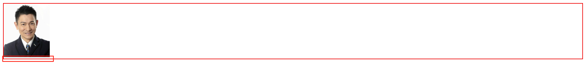
主要解决方法有两种:
- 给图片添加 vertical-align:middle | top| bottom 等。 (提倡使用的)
<!DOCTYPE html>
<html lang="en">
<head>
    <meta charset="UTF-8">
    <meta name="viewport" content="width=device-width, initial-scale=1.0">
    <title>Document</title>
    <style>
        div {
            border: 2px solid red;
        }
        img {
            vertical-align: bottom;
        }
    </style>
</head>
<body>
    <div>
        <img src="ldh.jpg" alt="">
    </div>
</body>
</html>- 把图片转换为块级元素 display: block;
<!DOCTYPE html>
<html lang="en">
<head>
    <meta charset="UTF-8">
    <meta name="viewport" content="width=device-width, initial-scale=1.0">
    <title>Document</title>
    <style>
        div {
            border: 2px solid red;
        }
        img {
            display: block;
        }
    </style>
</head>
<body>
    <div>
        <img src="ldh.jpg" alt="">
    </div>
</body>
</html>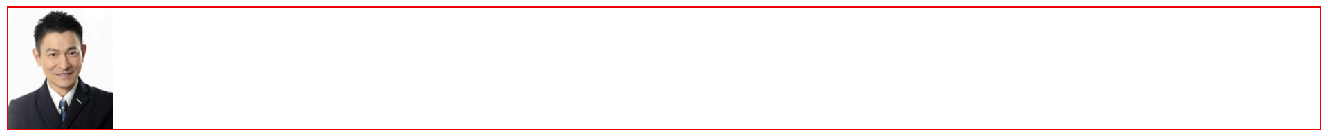
6.溢出的文字省略号显示
6.1 单行文本溢出显示省略号
单行文本溢出显示省略号--必须满足三个条件:
  /*1. 先强制一行内显示文本*/
   white-space: nowrap;  ( 默认 normal 自动换行)

  /*2. 超出的部分隐藏*/
   overflow: hidden;

  /*3. 文字用省略号替代超出的部分*/
text-overflow: ellipsis;<!DOCTYPE html>
<html lang="en">
<head>
<meta charset="UTF-8">
<meta name="viewport" content="width=device-width, initial-scale=1.0">
<title>Document</title>
<style>
div {
height: 100px;
width: 100px;
background-color: pink;
margin: 0 auto;
/*1. 先强制一行内显示文本*/
white-space: nowrap;
/*2. 超出的部分隐藏*/
overflow: hidden;
/*3. 文字用省略号替代超出的部分*/
text-overflow: ellipsis;
}
</style>
</head>
<body>
<div>
这是一堆文字这是一堆文字
</div>
</body>
</html>
6.2 多行文本溢出显示省略号(了解)
 多行文本溢出显示省略号,有较大兼容性问题,适合于webKit浏览器或移动端(移动端大部分是webkit内核)
/*1. 超出的部分隐藏 */
overflow: hidden;

/*2. 文字用省略号替代超出的部分 */
text-overflow: ellipsis;

/* 3. 弹性伸缩盒子模型显示 */
display: -webkit-box;

/* 4. 限制在一个块元素显示的文本的行数 */
-webkit-line-clamp: 2;

/* 5. 设置或检索伸缩盒对象的子元素的排列方式 */
-webkit-box-orient: vertical;
7. 常见布局技巧
7.1 margin负值运用
- 让每个盒子margin 往左侧移动 -1px 正好压住相邻盒子边框
<!DOCTYPE html>
<html lang="en">
<head>
    <meta charset="UTF-8">
    <meta name="viewport" content="width=device-width, initial-scale=1.0">
    <title>Document</title>
    <style>
        ul li {
            list-style: none;
            float: left;
            width: 150px;
            height: 200px;
            border: 2px solid red;
            margin-left: -2px;
        }
    </style>

</head>
<body>
<ul>
    <li>1</li>
    <li>2</li>
    <li>3</li>
    <li>4</li>
    <li>5</li>
</ul>
</body>
</html>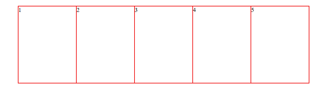
- 鼠标经过某个盒子的时候,提高当前盒子的层级即可(如果没有有定位,则加相对定位(保留位置),如果有定位,则加z-index)
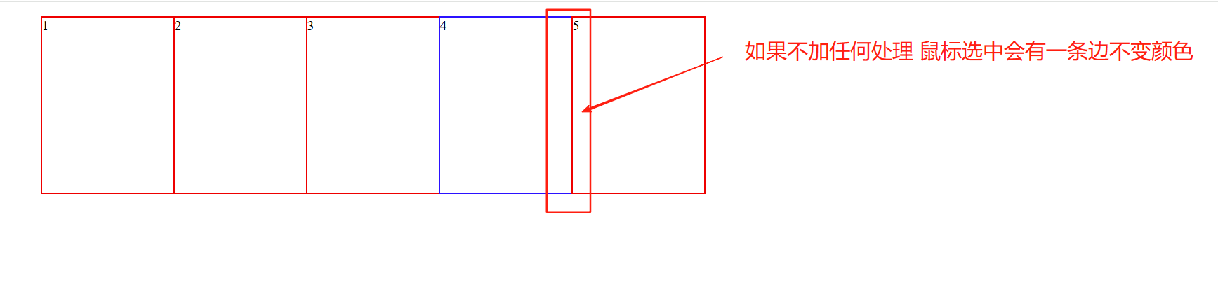
解决方案
- 给经过效果添加相对定位
<!DOCTYPE html>
<html lang="en">
<head>
    <meta charset="UTF-8">
    <meta name="viewport" content="width=device-width, initial-scale=1.0">
    <title>Document</title>
    <style>
        ul li {
            list-style: none;
            float: left;
            width: 150px;
            height: 200px;
            border: 2px solid red;
            margin-left: -2px;
        }
        ul li:hover {
            position: relative;
            border: 2px solid blue;
        }
    </style>

</head>
<body>
    <ul>
        <li>1</li>
        <li>2</li>
        <li>3</li>
        <li>4</li>
        <li>5</li>
    </ul>
</body>
</html>- 如果父盒子也要添加定位,那添加定位的方案就不行了,所以我们换成添加z-index的方式。
注意: 父盒子要有相对定位的时候使用
<!DOCTYPE html>
<html lang="en">
<head>
    <meta charset="UTF-8">
    <meta name="viewport" content="width=device-width, initial-scale=1.0">
    <title>Document</title>
    <style>
        ul li {
            position: relative;
            list-style: none;
            float: left;
            width: 150px;
            height: 200px;
            border: 2px solid red;
            margin-left: -2px;
        }
        ul li:hover {

            border: 2px solid blue;
            z-index: 2;
        }
    </style>

</head>
<body>
    <ul>
        <li>1</li>
        <li>2</li>
        <li>3</li>
        <li>4</li>
        <li>5</li>
    </ul>
</body>
</html>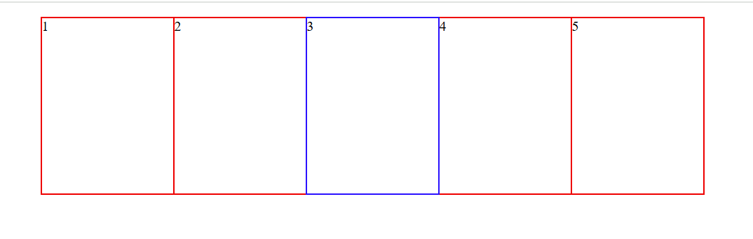
### 7.2 文字围绕浮动元素
效果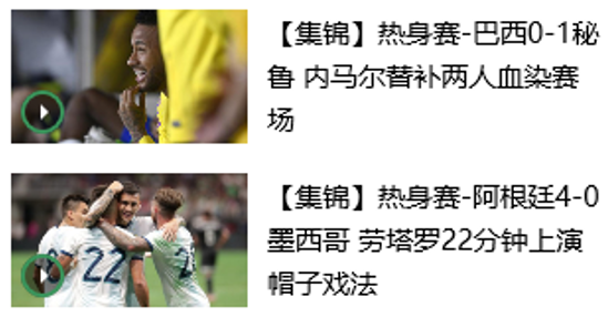
布局示意图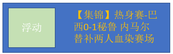
巧妙运用浮动元素不会压住文字的特性
<!DOCTYPE html>
<html lang="en">
<head>
    <meta charset="UTF-8">
    <meta name="viewport" content="width=device-width, initial-scale=1.0">
    <title>Document</title>
    <style>
        * {
            margin: 0;
            padding: 0;
        }
        .box {
            width: 300px;
            height: 70px;
            background-color: pink;
            margin: 0 auto;
            padding: 5px;
        }
        .div1 {
            float: left;
            width: 120px;
            height: 70px;
            margin-right: 5px;
        }
        .div1 img {
            width: 100%;
        }
    </style>
</head>
<body>
    <div class="box">
        <div class="div1">
            <img src="img.png" alt="">
        </div>
        <p>【集锦】热身赛-巴西0-1秘鲁 内马尔替补两人血染赛场</p>
    </div>
</body>
</html>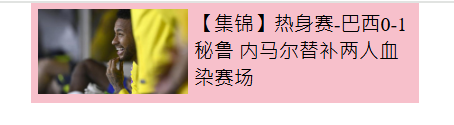
7.3 行内块巧妙运用
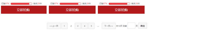
页码在页面中间显示:
- 把这些链接盒子转换为行内块,之后给父级指定
text-align:center; - 利用行内块元素中间有缝隙,并且给父级添加
text-align:center; 行内块元素会水平会居中
<!DOCTYPE html>
<html lang="en">
<head>
<meta charset="UTF-8">
<meta name="viewport" content="width=device-width, initial-scale=1.0">
<title>Document</title>
<style>
* {
margin: 0;
padding: 0;
}
.box {
text-align: center;
}
.box a {
display: inline-block;
height: 36px;
width: 36px;
background-color: #f7f7f7;
border: 1px solid #ccc;
text-align: center;
line-height: 36px;
text-decoration: none;
color: black;
}
.box .prev,
.box .next {
width: 72px;
}
.box .current,
.box .elp {
border: none;
background-color: #fff;
}
input {
height: 25px;
width: 36px;
border: 1px solid #ccc;
outline: none;
}
button {
height: 36px;
width: 36px;
background-color: #f7f7f7;
border: 1px solid #ccc;
margin-left: 10px;
}
</style>
</head>
<body>
<div class="box">
<a href="#" class="prev"><<上一页</a>
<a href="#" class="current">1</a>
<a href="#">2</a>
<a href="#">3</a>
<a href="#">4</a>
<a href="#">5</a>
<a href="#">6</a>
<a href="#">7</a>
<a href="#" class="elp">...</a>
<a href="#" class="next">下一页>></a>
到第
<input type="text" name="" id="">
页
<button>确定</button>
</div>
</body>
</html>
7.4. CSS 三角强化案例
7.4.1 原理


- 先生成四个等腰三角形
<!DOCTYPE html>
<html lang="en">
<head>
    <meta charset="UTF-8">
    <meta name="viewport" content="width=device-width, initial-scale=1.0">
    <title>Document</title>
    <style>
        div {
            height: 0;
            width: 0;
            border-top: 50px solid red;
            border-left: 50px solid yellow;
            border-bottom: 50px solid green;
            border-right: 50px solid blue;
        }
    </style>
</head>
<body>
    <div></div>
</body>
</html>
- 去掉底部边款变成两个直角三角形和一个大等腰三角形
<!DOCTYPE html>
<html lang="en">
<head>
    <meta charset="UTF-8">
    <meta name="viewport" content="width=device-width, initial-scale=1.0">
    <title>Document</title>
    <style>
        div {
            height: 0;
            width: 0;
            border-top: 100px solid red;
            border-left: 50px solid yellow;
            border-bottom: 0 solid green;
            border-right: 50px solid blue;
        }
    </style>
</head>
<body>
    <div></div>
</body>
</html>- 去掉左侧边框变成两个直角三角形
<!DOCTYPE html>
<html lang="en">
<head>
    <meta charset="UTF-8">
    <meta name="viewport" content="width=device-width, initial-scale=1.0">
    <title>Document</title>
    <style>
        div {
            height: 0;
            width: 0;
            border-top: 100px solid red;
            border-left: 0 solid yellow;
            border-bottom: 0 solid green;
            border-right: 50px solid blue;
        }
    </style>
</head>
<body>
    <div></div>
</body>
</html>
- 将顶部的边框变成透明就形成一个直角三角形效果
<!DOCTYPE html>
<html lang="en">
<head>
    <meta charset="UTF-8">
    <meta name="viewport" content="width=device-width, initial-scale=1.0">
    <title>Document</title>
    <style>
        div {
            height: 0;
            width: 0;
            border-top: 100px solid transparent;
            border-left: 0 solid yellow;
            border-bottom: 0 solid green;
            border-right: 50px solid blue;
        }
    </style>
</head>
<body>
    <div></div>
</body>
</html>
- 最终简写写法
<!DOCTYPE html>
<html lang="en">
<head>
    <meta charset="UTF-8">
    <meta name="viewport" content="width=device-width, initial-scale=1.0">
    <title>Document</title>
    <style>
        div {
            width: 0;
            height: 0;

            /* 1.只保留右边的边框有颜色 */
            border-color: transparent blue transparent transparent;
            /* 2. 样式都是solid */
            border-style: solid;
            /* 3. 上边框宽度要大, 右边框 宽度稍小, 其余的边框该为 0 */
            border-width: 100px 50px 0 0 ;
        }
    </style>
</head>
<body>
<div></div>
</body>
</html>
7.4.2 案例效果

代码参考
<!DOCTYPE html>
<html lang="en">
<head>
    <meta charset="UTF-8">
    <meta name="viewport" content="width=device-width, initial-scale=1.0">
    <title>Document</title>
    <style>
        .box {
            width: 160px;
            height: 24px;
            line-height: 24px;
            border: 1px solid red;
            margin: 0 auto;
        }
        .miaosha {
            position: relative;
            float: left;
            width: 90px;
            height: 100%;
            background-color: red;
            color: #fff;
            text-align: center;
            font-weight: 700;
            margin-right: 8px;
        }
        .miaosha i {
            position: absolute;
            right: 0;
            top: 0;
            height: 0;
            width: 0;
            /* 1.只保留右边的边框有颜色 */
            border-color: transparent #fff transparent transparent;
            /* 2. 样式都是solid */
            border-style: solid;
            /* 3. 上边框宽度要大, 右边框 宽度稍小, 其余的边框该为 0 */
            border-width: 24px 10px 0 0 ;
        }
        .origin {
            font-size: 12px;
            color: gray;
            text-decoration: line-through;
        }
    </style>
</head>
<body>
    <div class="box">
        <span class="miaosha">
            ¥1650
            <i></i>
        </span>
        <span class="origin">¥5650</span>
    </div>
</body>
</html>
8. CSS 初始化
不同浏览器对有些标签的默认值是不同的,为了消除不同浏览器对HTML文本呈现的差异,照顾浏览器的兼容,我们需要对CSS 初始化
简单理解: CSS初始化是指重设浏览器的样式。(也称为CSS reset) 每个网页都必须首先进行 CSS初始化。
这里我们以 京东CSS初始化代码为例。
/* 把我们所有标签的内外边距清零 */
* {
    margin: 0;
    padding: 0
}
/* em 和 i 斜体的文字不倾斜 */
em,
i {
    font-style: normal
}
/* 去掉li 的小圆点 */
li {
    list-style: none
}

img {
    /* border 0 照顾低版本浏览器 如果 图片外面包含了链接会有边框的问题 */
    border: 0;
    /* 取消图片底侧有空白缝隙的问题 */
    vertical-align: middle
}

button {
    /* 当我们鼠标经过button 按钮的时候,鼠标变成小手 */
    cursor: pointer
}

a {
    color: #666;
    text-decoration: none
}

a:hover {
    color: #c81623
}

button,
input {
    /* "\5B8B\4F53" 就是宋体的意思 这样浏览器兼容性比较好 */
    font-family: Microsoft YaHei, Heiti SC, tahoma, arial, Hiragino Sans GB, "\5B8B\4F53", sans-serif
}

body {
    /* CSS3 抗锯齿形 让文字显示的更加清晰 */
    -webkit-font-smoothing: antialiased;
    background-color: #fff;
    font: 12px/1.5 Microsoft YaHei, Heiti SC, tahoma, arial, Hiragino Sans GB, "\5B8B\4F53", sans-serif;
    color: #666
}

.hide,
.none {
    display: none
}
/* 清除浮动 */
.clearfix:after {
    visibility: hidden;
    clear: both;
    display: block;
    content: ".";
    height: 0
}

.clearfix {
    *zoom: 1
}
Unicode编码字体:
把中文字体的名称用相应的Unicode编码来代替,这样就可以有效的避免浏览器解释CSS代码时候出现乱码的问题。
比如:
黑体 \9ED1\4F53
宋体 \5B8B\4F53
微软雅黑 \5FAE\8F6F\96C5\9ED1